
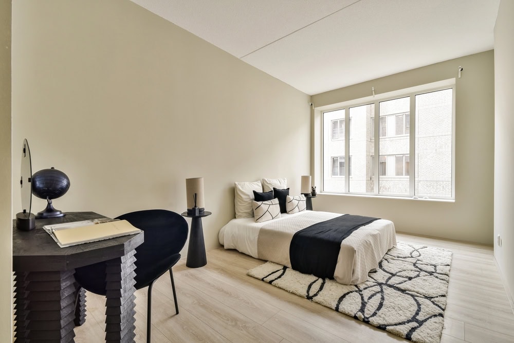
You fell in love with a gray at the store, painted the room, and now it reads blue — or worse, a sickly green. You’re not imagining it. Understanding how lighting affects paint color in Churchville, PA homes is the difference between a color you love and a costly repaint. Here’s what you’ll learn: why the same paint shifts from room to room, how to read undertones, and a simple way to test colors so you get it right the first time.
The same color, three different rooms
Paint has no fixed color — it only reflects the light hitting it. Change the light and you change the color. That’s why a swatch looks perfect in the showroom and wrong on your wall: the store’s lighting, your windows, and your bulbs are all different. Two things drive the shift most: the direction of natural light and the type of artificial light.
Natural light: which way does the room face?
The direction your windows face sets a room’s whole mood:
- North-facing rooms get cool, indirect light that mutes color and pulls out cool undertones — whites can look gray, and cool colors can feel flat. Warmer shades counteract this.
- South-facing rooms get bright, warm light most of the day, which makes almost any color look its best (and can intensify bold shades).
- East-facing rooms are warm in the morning, cooler by afternoon.
- West-facing rooms are cooler early, then glow warm and golden in the evening.
For north-facing room paint colors, lean warm (soft whites with a hint of warmth, warm greiges) so the space doesn’t feel cold.
Natural vs. artificial light
Your bulbs matter as much as your windows — natural vs. artificial light can flip a color after sunset:
- Warm bulbs (2700K) add a cozy yellow cast — flattering on warm colors, but they can dull cool blues and grays.
- Cool/daylight bulbs (4000K+) render color more truly and keep cool tones crisp, but can feel clinical in a living space.
- Mix and check both: a color that’s perfect at noon can shift noticeably under evening lamplight.
Choosing warm vs. cool light bulbs is part of the color decision, not an afterthought.
Undertones: the hidden reason colors “go wrong”
Almost every paint color has a hidden undertone — the subtle secondary color underneath. That “simple” gray might have a blue, green, or purple base, and the room’s light amplifies it. Reading paint undertones is the pro’s secret:
- Compare your sample against a pure white card to reveal the undertone.
- Watch how it behaves in your light, morning and night.
- Match undertones to your fixed elements — flooring, countertops, and tile all carry undertones too.
How to test paint colors the right way
Never commit off a tiny chip. Testing paint samples properly takes a day and saves a repaint:
- Buy sample pots of your top 2–3 colors.
- Paint large swatches (at least 2 ft square), two coats, on more than one wall.
- Better yet, paint poster board you can move around the room and hold near trim and furniture.
- View morning, midday, and night under both daylight and your bulbs.
- Live with it a couple of days before deciding.
Best colors for dark, low-light rooms
For choosing paint colors for low-light rooms in Holland, Churchville, and nearby, a few guidelines:
- Embrace warm, light shades (warm whites, soft creams, warm greiges) to bounce what little light there is.
- Or go boldly dark — in a truly dim room, a rich, cozy color often looks better than a washed-out light one that turns gray.
- Add layered lighting (lamps, sconces) rather than fighting the shade with a single overhead fixture.
Get the color right the first time
The takeaway: judge every color in the room it’s going in, under both daylight and your evening bulbs, and pay attention to undertones. A color that dazzles in one room can disappoint next door — so test big, test in place, and test at different times of day.
When the stakes are a whole-home repaint, a second, trained eye helps. Our interior painting team helps Churchville and Holland homeowners read undertones and light before a drop of paint goes on. For more color inspiration, see our smart paint color ideas, and if you’re feeling bold, our take on color drenching and rich hues pairs perfectly with getting the lighting right. Color authorities like Benjamin Moore publish helpful undertone and lighting guidance too.
Ready to choose colors you’ll love?
Don’t gamble on a swatch — get colors that look right in your light, all day long. Aspen Painting & Wallcovering helps homeowners across Churchville, Holland, and the surrounding Bucks County communities pick and apply colors with confidence — Clean, Courteous, Reliable, in every room.
Call 215-773-8422 or schedule a free, no-pressure estimate. We’ll help you test, read the light, and land on colors you’ll be glad you chose.
Frequently Asked Questions
Why does my paint color look different in another room?
Because paint only reflects the light around it. A room’s window direction and its bulbs change which undertones show, so the same color can look warmer, cooler, lighter, or darker from one room to the next.
What are the best paint colors for a north-facing room?
North light is cool and indirect, so warm shades work best — soft warm whites, creams, and warm greiges keep the room from feeling cold or gray. Avoid very cool grays and blues unless you want a deliberately crisp, cool look.
How do I test a paint color properly?
Buy sample pots, paint large two-coat swatches (or poster board you can move), and view them on multiple walls at morning, midday, and night under both daylight and your own bulbs. Live with them a day or two before deciding.
What are paint undertones and why do they matter?
An undertone is the subtle secondary color beneath the main shade — a gray might be blue-, green-, or purple-based. Your room’s light amplifies it, which is why colors “go wrong.” Matching undertones to your flooring and finishes keeps everything cohesive.
Should I use warm or cool light bulbs with my paint color?
It depends on the mood: warm (2700K) bulbs cozy up a space but can dull cool colors, while cool/daylight bulbs render color more truly but can feel clinical. Always check your chosen color under the bulbs you’ll actually live with.

Ray is an inspiring leader with a strong work ethic stemming from his exemplary upbringing in a caring and loving family environment. His parents modeled the importance of integrity and hard work to him and his siblings, values which Ray now instills in his teenage daughter. As the owner of Aspen Painting & Wallcovering, Inc., he leads by example by expecting nothing but the best from himself and his employees. His primary goal is to provide superior service and quality craftsmanship to each of his clients so that they become enthusiastic ambassadors for the company. Ray is a passionate team player who always strives to exceed expectations.