
Small rooms can be some of the hardest spaces to paint well.
A color that looks soft and airy in a large living room can feel flat in a tight bedroom. A shade that seems rich and warm on a paint chip can make a compact office feel boxed in once it covers every wall. That is why choosing paint for a smaller room takes more thought than many homeowners expect.
For homeowners searching for the Best Paint Colors for Small Rooms in Holland, the goal is usually not just to make the room look nice. It is to make the room feel better. You want it to feel brighter, calmer, more open, and easier to enjoy every day.
That can absolutely be done with color.
The right paint can help a room feel taller, wider, lighter, and cleaner. It can soften awkward corners, reduce the heavy feel of low light, and create a more comfortable flow from wall to wall.
The wrong paint can do the opposite.
This guide breaks down the best paint color directions for small rooms, how light affects color in compact spaces, and which shades tend to work best for Holland homeowners who want rooms to feel more open without losing warmth or style.
Why Paint Color Matters So Much in a Small Room
In a larger room, you have more visual space to work with.
There may be more windows, more furniture spread out, higher ceilings, and greater distance between one wall and the next. In a small room, every design choice shows up faster. Paint color is one of the biggest factors in how the room feels, since the walls are always in view.
That means color can significantly change the experience of the room.
A lighter, softer shade can hmakethe walls seem lfarther apart
A dark, heavy tone can bring the walls inward and make the room feel tighter.
That does not mean every small room has to be painted white. It does mean the color choice needs to support the room rather than fight it.
For many homeowners in Holland, small rooms include:
- guest bedrooms
- powder rooms
- nurseries
- home offices
- laundry rooms
- hall bathrooms
- reading nooks
- bonus spaces with limited natural light
Each of these rooms can benefit from a paint color strategy that helps the area feel easier to live in.
What Makes a Paint Color Good for a Small Room?
The best paint colors for small rooms usually do one or more of the following:
- reflect light well
- create softness instead of harsh contrast
- reduce visual heaviness
- make transitions feel smoother
- support the room’s natural lighting conditions
- keep the space from feeling closed in
That is why many successful small-room colors fall into lighter or mid-tone families rather than very dark or very intense shades.
Still, light color alone is not enough.
A pale paint with the wrong undertone can feel cold, dull, or off-balance. A soft neutral with the right undertone can make the same room feel calm and welcoming.
The best choice depends on how the room is used and how the light behaves throughout the day.
How Natural Light Changes Paint in Small Spaces
This is one of the biggest reasons people end up unhappy with paint.
They choose a color based on a sample card or a photo, but they do not account for the room’s lighting.
In a small room, light matters even more because there is less space to soften color shifts.
North-facing rooms
North-facing light often feels cooler and softer.
That can make some grays, whites, and pale blues feel colder than expected. In these rooms, warmer whites, soft greiges, creamy neutrals, and gentle warm taupes often feel more balanced.
South-facing rooms
South-facing light is usually brighter and warmer.
That can help many colors feel more open. It also means warm shades may become even warmer. Soft whites, balanced greiges, and muted greens often work well here.
East-facing rooms
East-facing rooms usually get brighter morning light and softer light later in the day.
These rooms can handle a wide range of colors, but it helps to test samples in the morning and afternoon so the room does not feel too cool as the day progresses.
West-facing rooms
West-facing rooms may feel dimmer early and warmer later.
Paint can shift a lot here. A color that feels neutral in the morning may look much warmer by evening. Soft, balanced neutrals often perform well in these spaces.
Best Color Families for Small Rooms in Holland
When homeowners look for the Best Paint Colors for Small Rooms in Holland, they are often looking for a category more than a single exact shade.
That is the right way to start.
Instead of chasing one trendy color name, focus on color families that often work well in smaller spaces.
1. Soft Warm Whites
Warm whites are often one of the safest and strongest choices for small rooms.
They reflect light well, help walls feel less heavy, and create a clean look without making the room feel stark.
This matters because bright white can sometimes feel too sharp in a small area, especially in rooms with limited natural light. A soft, warm white gives you brightness without that hard edge.
Warm whites work especially well in:
- small bedrooms
- hall bathrooms
- offices
- narrow sitting rooms
- low-light corners of the home
They also pair easily with wood flooring, soft trim, and a wide range of decor styles.
2. Light Greige Tones
Greige falls between gray and beige, making it useful for small rooms.
It brings some of the softness of beige with some of the cleaner feel of gray. For homeowners who want a neutral room without making it feel too yellow or too cool, greige is often a strong middle ground.
A light greige can give a small room more depth than white while still helping it stay open.
This color family tends to work well when:
- you want a calm, current look
- the room has mixed natural and artificial light
- you want the space to feel soft rather than bright white
- you need a neutral that works with many furniture finishes
In Holland homes, light greige can be a smart choice for guest rooms, offices, and flex spaces that need to feel polished without looking too formal.
3. Pale Beige and Sand Tones
Some homeowners overlook beige because they assume it will look dated.
That is usually only true when the beige is too muddy, too yellow, or too heavy for the room.
A cleaner pale beige or sand tone can be excellent in a small room. It adds warmth and softness while helping the space feel easy and welcoming. This is especially helpful in rooms that do not get strong direct sunlight.
These shades work well when you want:
- a warmer feel than gray
- a comfortable look that is not too stark
- a color that supports a cozy room without shrinking it
- a neutral base that works with natural textures
Beige can be very effective in small bedrooms and small living areas where a more relaxed feel matters.
4. Light Blue-Gray Shades
Soft blue-gray can be a great choice when used carefully.
In the right room, it creates a calm, airy feeling that helps the space feel more open. It is especially appealing in small bathrooms, bedrooms, and quiet workspaces.
The caution is an undertone.
If the room already gets cool light, some blue-gray shades can feel too cold. The better versions for small spaces usually have a gentle softness rather than a sharp icy tone.
These shades are often a good fit if you want the room to feel:
- peaceful
- fresh
- slightly coastal or airy
- clean without looking plain
For Holland homeowners who want a lighter room with a hint of color, this family can work very well.
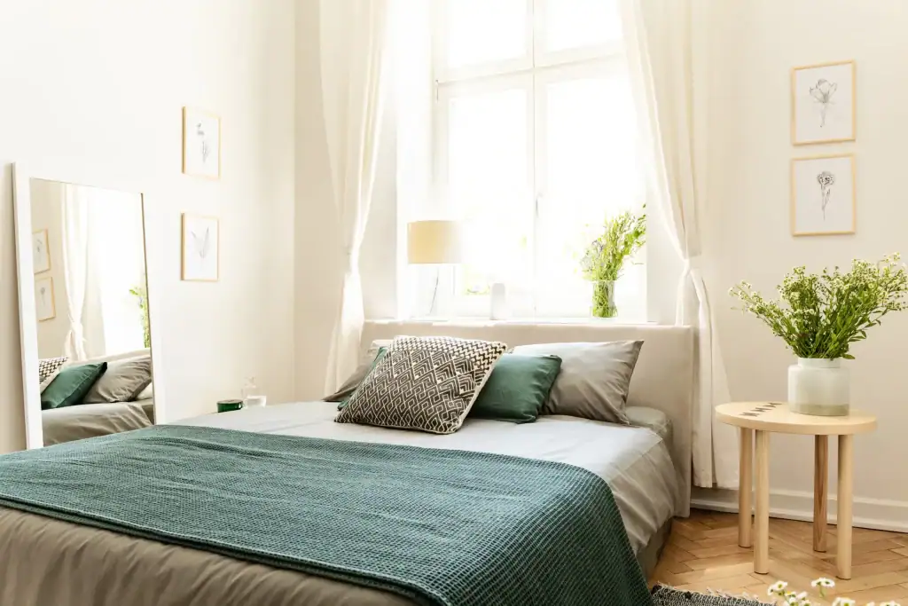
5. Soft Sage and Muted Green
Muted greens are becoming more popular for good reason.
A soft sage can make a small room feel grounded and relaxed without making it feel dark. It adds more personality than a neutral while still staying easy on the eye.
Green tends to feel comfortable because it connects well with natural elements. In a small room, this can make the space feel calm rather than cramped.
Soft green can work beautifully in:
- powder rooms
- offices
- guest rooms
- reading spaces
- small bedrooms
The key is to keep the shade muted. Strong or overly dark green can start to reduce the sense of openness.
6. Pale Taupe
Taupe can be one of the most useful colors for a small room.
It has more body than white but often feels smoother and more balanced than a stronger beige or gray. A pale taupe can help a room feel refined, soft, and slightly warmer without becoming heavy.
This is a strong option when you want the room to feel:
- settled
- inviting
- neutral but not flat
- slightly elevated without being dramatic
It also tends to work well in rooms where the lighting changes a lot during the day.
7. Very Light Dusty Blue or Green
For homeowners who want a bit more charm, a very light dusty color can work beautifully.
Think soft blue, muted sea-glass green, or a washed tone with gray in it. These shades can help a small room feel brighter and more designed without overwhelming the walls.
This color direction works best when the shade stays soft.
Too much saturation in a small room can make the walls feel close. A lighter dusty version gives you color without the pressure.
Colors That Can Make Small Rooms Feel Smaller
Not every bold or dark color is wrong for a compact room.
But if your main goal is openness, some color choices usually make that harder.
These include:
- very dark charcoal
- deep brown
- intense navy in low light
- heavy red tones
- bright saturated yellow
- strong purple
- dark cool gray in a dim room
These colors can still work in certain design plans, but they usually are not the best starting point when your goal is to make the room feel larger and lighter.
That is why homeowners looking for the Best Paint Colors for Small Rooms in Holland often get better results from softer shades with flexible undertones.
The Role of Undertones
Undertones are what make one white look clean, and another look creamy.
They are what make one beige feel fresh,h and another feel dull.
In small rooms, undertones show up fast.
A paint may look neutral in the store and then suddenly appear pink, yellow, blue, or green once it is on the wall. That is why choosing by color family alone is not enough.
You also need to look at:
- the flooring
- trim color
- amount of daylight
- furniture tones
- nearby rooms
- the purpose of the space
A warm undertone usually helps low-light rooms feel more inviting.
A balanced undertone helps rooms with shifting light stay stable.
A cool undertone can work well in bright rooms but may feel flat in darker ones.
Should You Always Use Light Paint in a Small Room?
Usually, lighter colors are the best place to start.
But “light” does not always mean plain.
A small room can still have style.
A soft green, pale taupe, muted blue-gray, or a creamy neutral can make the room feel more designed than basic white while still keeping it open.
The goal is not to strip the room of personality.
The goal is to avoid weighing it down.
That is a big difference.
If the room is naturally bright, you may even be able to use a medium tone successfully. But for most small rooms, the best results come from colors that carry some softness and reflect enough light to keep the space comfortable.
Paint Finish Matters Too
Color gets most of the attention, but finish also affects how a small room feels.
A finish that reflects too much light can highlight wall flaws and create glare. A finish that is too flat may not be practical in a room that is often touched.
In many small rooms:
- eggshell works well for bedrooms and low-traffic spaces
- satin may work well for bathrooms or rooms needing more wipeability
- trim often looks clean in a semi-gloss or a similar durable finish
The right finish helps support the color rather than distract from it.
How to Make a Small Room Feel Bigger With More Than Just Color
Paint color does a lot, but it works even better when paired with smart visual choices.
Here are a few ways to help a small room feel bigger, along with the right paint:
Keep trim, clean, and well-defined
Fresh trim can make the whole room look sharper and brighter.
Limit harsh contrast
A strong jump between wall color, ceiling color, trim, and furnishings can break the room into pieces. Softer transitions help the space feel smoother.
Use the ceiling wisely
A lighter ceiling often helps the room feel taller.
Keep clutter low
Even the best paint color cannot fix a room that feels crowded with too many visual elements.
Let light move through the room
Window treatments, mirrors, and furniture placement all affect how open the room feels.
Best Paint Color Ideas by Room Type
Different small rooms often benefit from different color directions.
Small bedroom
Soft warm white, pale taupe, muted greige, or very light sage often work well. These colors help the room feel restful without feeling boxed in.
Small bathroom
Warm white, pale blue-gray, soft green, or light greige can help a bathroom feel cleaner and brighter.
Small home office
A balanced greige, soft taupe, or muted green can help the room feel calm and productive without becoming dull.
Small guest room
A pale neutral with gentle warmth usually works well because it feels inviting and flexible for different decor choices.
Small hallway nook or bonus room
A lighter neutral usually helps these awkward spaces feel intentional and less cramped.
Common Mistakes Homeowners Make
There are a few issues that keep popping up in small-room paint projects.
Choosing a color that is too dark for the light
A nice color in a bright showroom may feel much heavier in a dim room at home.
Ignoring undertones
This is one of the biggest reasons paint looks wrong after it is on the wall.
Testing too little
A tiny sample is not enough. In a small room, color shifts matter.
Copying a photo without matching the room
Online photos can help with direction, but the lighting and surroundings in your home are what matter most.
Picking color before thinking about the room’s use
A color for a restful guest room may not be the best choice for a focused work area.
How Holland Homeowners Can Choose With Confidence
If you are trying to pick the Best Paint Colors for Small Rooms in Holland, start with a practical process.
Look at the room in morning light and evening light.
Think about whether you want the room to feel airy, warm, calm, or fresh.
Notice the flooring, trim, and the surrounding areas.
Then narrow the choice to a soft, flexible color family that supports the room’s size and light.
In many cases, the best results come from shades that are:
- light to mid-light
- warm or balanced in undertone
- soft rather than intense
- easy to live with every day
That is what helps a compact room feel more comfortable long after the paint dries.
The best paint colors for small rooms are usually the ones that help the room breathe.
For many Holland homeowners, that means soft warm whites, light greiges, pale taupes, clean beiges, muted greens, or gentle blue-grays. These shades can make a room feel more open without making it feel cold or lifeless.
The right paint color does not just change the wall.
It changes the mood of the room.
It changes how the light moves.
It changes whether the space feels tight or easy.
If your goal is to make a small room feel brighter, bigger, and more inviting, start with a color that supports the room’s light, size, and purpose. That is usually the smartest way to get a result that still looks good months and years from now.
Choosing the right paint colors can make small rooms in your Holland, PA home feel brighter, more open, and more inviting. From soft neutrals to light-reflecting shades, the right choices create a noticeable difference. Aspen Painting, trusted Painters in Holland, helps homeowners select beautiful colors that maximize space, style, and comfort.
FAQs
1. What are the best paint colors for small rooms in Holland?
Soft warm whites, light greiges, pale taupes, muted greens, and gentle blue-gray shades are often strong choices because they help smaller rooms feel brighter and more open.
2. Should small rooms always be painted white?
No. White is a common choice, but soft neutrals and muted colors can work just as well. The better goal is choosing a shade that reflects light and does not make the room feel heavy.
3. Are dark colors bad for small rooms?
Not always, but they usually make a room feel more enclosed if openness is the goal. In most compact spaces, lighter and softer colors are easier to work with.
4. What undertones work best in small rooms?
Warm or balanced undertones often work best, especially in rooms with limited natural light. Very cool undertones can make some small spaces feel colder or flatter.
5. How can I make a small room look bigger with paint?
Choose a light or mid-light color with soft undertones, use a lighter ceiling, avoid harsh contrast, and make sure the finish fits the room’s needs. All of these choices help the room feel more open.

Ray is an inspiring leader with a strong work ethic stemming from his exemplary upbringing in a caring and loving family environment. His parents modeled the importance of integrity and hard work to him and his siblings, values which Ray now instills in his teenage daughter. As the owner of Aspen Painting & Wallcovering, Inc., he leads by example by expecting nothing but the best from himself and his employees. His primary goal is to provide superior service and quality craftsmanship to each of his clients so that they become enthusiastic ambassadors for the company. Ray is a passionate team player who always strives to exceed expectations.