
Have you ever painted a room a hue you loved in the store, only to find it appeared entirely different at home? More often than not, the culprit is lighting—specifically, natural light. The quality, direction, and intensity of sunlight entering your space are pivotal in how paint colors look and feel. Even the finest brushstrokes and most expensive paint can’t overcome the impact that sunlight (or its absence) has on your walls.
Natural light shapes our perception of color. A soft beige might look bright and airy in a sun-drenched living room but could appear dull and flat under limited daylight in a north-facing space. Meanwhile, a bold navy could feel sophisticated in a room with ample southern sunshine but too heavy where windows face east or west. Understanding how your home’s unique lighting conditions interact with color is the key to selecting shades that truly shine.
In this blog, we’ll explore the essentials of natural light and how it influences paint color. We’ll discuss how directional sunlight—from north, south, east, and west—affects color temperature, guide you through testing paint swatches, and introduce popular palettes that capitalize on natural illumination. Finally, we’ll show you how to round out your design with artificial lighting and décor accents, ensuring every inch of your home feels cohesive and inviting. Whether freshening up a single room or embarking on a whole-home makeover, let the sun guide you to perfect, light-filled results.
1. Understanding the Power of Natural Light
Natural light is not just a means of visibility—it’s a dynamic source of warmth, color, and mood. Its intensity and hue change throughout the day, from warm, golden tones in early morning and late afternoon to cooler, bluer tones at midday. This ever-changing nature of sunlight directly influences our perception of paint colors in a room. Understanding this power of natural light empowers you to make informed decisions about painting, going beyond shade preference to appreciate how a color will live and breathe within your unique lighting conditions.
When sunlight enters a space, it bounces off every surface, from your walls and floors to your furniture and décor. Each reflection subtly alters a paint color’s appearance, intensifying certain tones while muting others. Light can also highlight textures and finishes—such as matte versus semi-gloss—emphasizing shadows, brushstrokes, or imperfections in the wall. This interplay between sunlight and pigment helps you appreciate and enhance your home’s unique features.
Moreover, the sun’s angle changes with the seasons, influencing the daylight a room receives. The sun is higher in summer, making some rooms feel bright and expansive. When the sun sits lower in the sky in winter, that room might lack direct light for most of the day. If you choose a color based solely on a quick trip to the paint store, you risk ignoring these fluctuations, leading to possible disappointment when the hue appears too dark, washed out, or off-tone at home.
To effectively harness the power of natural light, it’s crucial to understand how direction, time of day, and climate can transform a color. Making informed decisions about painting involves more than shade preference—it demands an appreciation of how that color will live and breathe within your unique lighting conditions. Embrace this interplay between sunlight and pigment, and you’ll be on your way to crafting a space that looks vibrant, balanced, and genuinely comfortable, no matter the time of day.
2. The Four Directions: North, South, East, and West
One of the most practical ways to gauge how natural light will affect your paint color is to consider which direction your windows face. In general, each cardinal direction produces a characteristic quality of light, impacting the room’s color temperature (warm vs. cool) and brightness.
2.1 North-Facing Rooms
North-facing windows often bring cooler, more diffuse light. Because the sun rarely shines directly from the north (in the northern hemisphere), these rooms can appear darker and sometimes even a bit grayish. Cool paint colors—like blues, greens, and grays—can feel cold or stark in north-facing spaces, whereas warm shades—creams, beiges, and gentle yellows—help balance this cooler light. If you choose a cooler hue, consider a slightly warmer undertone to keep the room cozy.
2.2 South-Facing Rooms
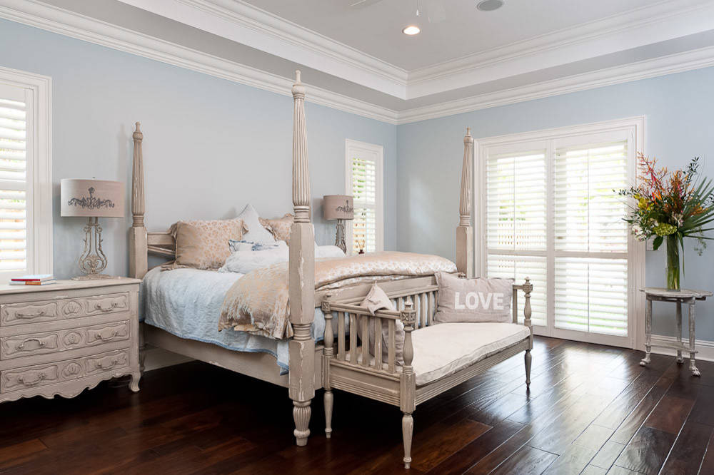
South-facing windows bask in sunlight for most of the day. This abundant light tends to be warm and bright, particularly around midday. Colors appear more vibrant in these rooms, so even lighter neutrals will stand out. If you have a small space facing south, lighter shades of white or cream can amplify the brightness. However, be mindful: too bright a color can become overwhelmingly intense under strong southern sunshine. Balancing bright light with slightly muted tones or off-whites can help create a sophisticated and comfortable atmosphere.
2.3 East-Facing Rooms
East-facing windows receive direct sunlight in the morning, transitioning to softer, more indirect light in the afternoon. The early light can be warm and golden, making yellows, pale blues, and soft greens appear especially cheerful at breakfast. As the sun moves westward, the light becomes cooler and more diffused, potentially causing these same colors to appear slightly dull. If you enjoy the morning glow, lean into warmer shades that complement the sunrise hues.
2.4 West-Facing Rooms
West-facing windows get the full force of afternoon and evening sunlight. Early in the day, these rooms might feel subdued or dim. As the sun descends, however, the space can flood with a rich, warm light that intensifies colors dramatically. Consider deeper neutrals or subdued blues and greens that won’t overpower the room in the late afternoon. Alternatively, embrace that dramatic glow with warm earth tones—like terracotta or burnt orange—that harmonize with the sunset’s golden hour.
Understanding these directional nuances helps you pick paint colors that look their best throughout the day. When you align your palette with the quality of light, you’ll ensure your rooms shine from dawn to dusk.
3. How to Test Paint Swatches for Optimal Illumination
Once you’ve narrowed down a few potential paint shades, it’s crucial to test them in real-life lighting conditions. While it might be tempting to skip this step and jump straight into painting, doing so can lead to costly color mismatches and post-paint regret. By testing your paint swatches, you can ensure that the colors you choose will look as you expect them to in your home.
- Collect Sample Pots: Most paint brands offer small sample containers. Purchase samples for each color you’re considering—preferably in the same sheen you plan to use in your final project (e.g., eggshell, satin, or semi-gloss).
- Apply Test Patches: Paint generous test patches on different walls, ideally at least 12” x 12” in size. Natural light varies around a room, so focus on areas near windows, corners where shadows gather, and larger expanses of wall that see direct light. Wait until the paint dries fully, as colors can shift dramatically once they set.
- Observe at Different Times of Day: Return to your test areas during morning, midday, and evening hours. The hue that looks perfect in the morning might seem too dark at night or too stark in the bright afternoon sun. Also, be mindful of seasonal changes. Evaluate your swatches for a few days to see how weather and sunlight changes affect them.
- Compare Undertones: Certain colors can have hidden undertones. A neutral gray might lean blue or green under specific lighting conditions. Likewise, a soft beige could reveal pinkish notes in warmer light. Observing how each swatch responds to different lighting scenarios will help you identify unwanted undertones before committing.
By investing some time in testing, you can ensure that your chosen paint color complements your home’s specific lighting nuances. This will create a room that feels harmonious, comfortable, and truly reflective of your style.
4. Popular Paint Color Palettes for Sunlit Rooms
Not all paint colors respond equally to abundant natural light. Some hues thrive in sunlit spaces, reflecting and amplifying the brightness, while others may appear washed out or overwhelmingly bold. Here are several popular palettes that often shine in well-lit rooms:
4.1 Classic Whites and Off-Whites
Few colors better highlight natural light than a clean white. Bright whites, such as pure or neutral whites without a noticeable undertone, make a sunlit room airy and expansive. However, stark whites can cause glare in spaces with intense southern or western sun. In such cases, a slightly off-white with subtle beige, gray, or cream undertones will soften the overall effect and add warmth.
4.2 Soft Neutrals
Shades like greige (a gray-beige blend), sandy beige, or warm taupe effectively balance warm and cool light. These neutrals exude a cozy, welcoming vibe in a south-facing living room without feeling too heavy. As the light shifts throughout the day, these adaptable hues subtly transform, often revealing hidden depths or gentle undertones that enhance the room’s character.
4.3 Pastels with Subdued Undertones
Pale blues, mint greens, lavender grays, and blush pinks can appear enchanting in a sunlit bedroom or kitchen. The key is to ensure the pastel has a soft gray, beige, or even yellow undertone to prevent it from looking too candy-like when light intensifies. These gentle shades exude a sense of tranquility, making them a perfect choice for spaces meant for relaxation or reflection.
4.4 Earth-Inspired Hues
In rooms that receive ample but not overpowering sunlight—like east- or west-facing spaces—earthy colors like warm sage green, terracotta or deep ochre can create a grounded, intimate feel. These shades are particularly compelling during the golden hours of sunrise or sunset when natural light enhances their warmth and depth.
You’ll create a beautifully illuminated interior by aligning your color choices with your lighting conditions. Whether you lean towards crisp whites or lush earth tones, test how these colors shift throughout the day. A subtle hue in the morning can radiate warmth by evening—embracing that transformation can bring a dynamic sense of life to your room.
5. Combining Artificial Lighting and Décor Accents for a Cohesive Look
Natural light is the star of any well-designed room, but it’s only one part of the equation. Once the sun sets, artificial lighting takes over—and your carefully chosen paint colors should still shine under lamps, pendants, or recessed fixtures. To maintain consistency, select bulbs that complement your color palette. Warm-white or soft-white bulbs (in the 2700K–3000K range) suit warm-toned paints, while daylight or cool-white bulbs (in the 3500K–4100K range) can enhance cooler shades of gray, blue, or green.
Décor accents further enhance the relationship between light and color. For example, mirrors reflect natural and artificial illumination, spreading brightness throughout the room. Artwork and textiles in complementary shades can help tie everything together, creating visual harmony. Choosing the right finishes—like matte paint for a cozy, low-sheen look or eggshell for a subtle gleam—can influence how light bounces off walls, furniture, and décor.
Don’t forget the role of window treatments. Sheer curtains or blinds can diffuse harsh sunlight while allowing enough natural light to glow. By blending thoughtful artificial lighting choices with complementary décor accents, you’ll ensure that your space remains cohesive, inviting, and visually captivating well after the sun goes down.
Natural light is a powerful design element, influencing how paint colors appear and how we experience a space throughout the day. By understanding the unique qualities of each direction’s sunlight and testing paint swatches under varying conditions, you can unlock colors that truly shine in your home. Whether you prefer the clean simplicity of classic white walls or the inviting warmth of earthy tones, ensuring that your paint selection complements your space’s natural illumination is key to creating a harmonious environment.
Remember, artificial lighting and décor play supporting roles in this grand show of light and color, helping you maintain a consistent, appealing look long after sunset. When all these elements come together, your home will radiate comfort, warmth, and style—just as you envisioned. If you’re ready to transform your interiors with paint accentuating natural light, consider contacting a professional painting service that understands the subtle dance between sunshine and shade. Your perfect, light-filled retreat awaits.
FAQ
Why does natural light affect paint colors differently than artificial light?
Natural light contains a full spectrum of colors and varies in intensity and temperature throughout the day, which can highlight different undertones in paint. Morning light often has a cooler, bluish tone, while midday light is brighter and more neutral, and evening light can be warmer with reddish hues. This dynamic range reveals subtle shifts in paint color that static artificial lighting, which often has a fixed color temperature, may not show.
How does the direction of natural light impact the appearance of paint colors?
The direction from which natural light enters a room plays a significant role. North-facing rooms receive cooler, diffused light, which can make colors appear darker or more muted. South-facing rooms get warmer, direct sunlight, often intensifying colors and bringing out warmer undertones. East and west-facing rooms experience changing light throughout the day, causing paint colors to shift from cool to warm tones depending on the time.
Why do some paint colors look completely different at various times of the day?
Paint colors can transform due to the changing color temperature of natural light. For instance, a gray paint might look bluish in the cool morning light, neutral under the bright midday sun, and slightly warmer or even brownish in the golden evening glow. This happens because light interacts with the pigments in the paint, emphasizing different hues based on the light’s wavelength at different times.
Can the season or weather affect how paint colors look in natural light?
Absolutely, seasonal changes and weather conditions alter the quality of natural light. In winter, light can be softer and cooler, often dulling paint colors, while summer light is brighter and warmer, making colors pop. Overcast days diffuse light, reducing shadows and vibrancy, whereas clear days enhance contrast and saturation, significantly changing a paint’s perceived shade.
What role do paint finishes play in color changes under natural light?
The finish of the paint, such as matte, satin, or gloss, influences how light reflects off the surface. Matte finishes absorb more light, often making colors appear softer or darker, while glossy finishes reflect light, enhancing brightness and sometimes shifting the perceived hue. Natural light amplifies these effects, as its varying angles and intensities interact differently with each finish type.

Ray is an inspiring leader with a strong work ethic stemming from his exemplary upbringing in a caring and loving family environment. His parents modeled the importance of integrity and hard work to him and his siblings, values which Ray now instills in his teenage daughter. As the owner of Aspen Painting & Wallcovering, Inc., he leads by example by expecting nothing but the best from himself and his employees. His primary goal is to provide superior service and quality craftsmanship to each of his clients so that they become enthusiastic ambassadors for the company. Ray is a passionate team player who always strives to exceed expectations.